How Apple Is Giving Design A Bad Name. For years, Apple followed user-centered design principles. Then something went wrong.
Once upon a time, Apple was known for designing easy-to-use, easy-to-understand products. It was a champion of the graphical user interface, where it is always possible to discover what actions are possible, clearly see how to select that action, receive unambiguous feedback as to the results of that action, and have the power to reverse that action–to undo it–if the result is not what was intended.
No more. Now, although the products are indeed even more beautiful than before, that beauty has come at a great price. Gone are the fundamental principles of good design: discoverability, feedback, recovery, and so on. Instead, Apple has, in striving for beauty, created fonts that are so small or thin, coupled with low contrast, that they are difficult or impossible for many people with normal vision to read. We have obscure gestures that are beyond even the developer’s ability to remember. We have great features that most people don’t realize exist.
The products, especially those built on iOS, Apple’s operating system for mobile devices, no longer follow the well-known, well-established principles of design that Apple developed several decades ago. These principles, based on experimental science as well as common sense, opened up the power of computing to several generations, establishing Apple’s well-deserved reputation for understandability and ease of use. Alas, Apple has abandoned many of these principles. True, Apple’s design guidelines for developers for both iOS and the Mac OS X still pay token homage to the principles, but, inside Apple, many of the principles are no longer practiced at all. Apple has lost its way, driven by concern for style and appearance at the expense of understandability and usage.
Apple is destroying design. Worse, it is revitalizing the old belief that design is only about making things look pretty. No, not so! Design is a way of thinking, of determining people’s true, underlying needs, and then delivering products and services that help them. Design combines an understanding of people, technology, society, and business. The production of beautiful objects is only one small component of modern design: Designers today work on such problems as the design of cities, of transportation systems, of health care. Apple is reinforcing the old, discredited idea that the designer’s sole job is to make things beautiful, even at the expense of providing the right functions, aiding understandability, and ensuring ease of use.
Apple, you used to be the leader. Why are you now so self-absorbed? Worse, why does Google follow all your worst examples?
Yes, once upon a time, Apple was known for its ease of use, for computers and applications that were understandable, powerful, and could be used without reference to any manuals. All the operations were discoverable (the power of menus), all could be undone or redone, and there was considerable feedback so you always knew what had just taken place. Users were encouraged to blossom, with greater and greater power being revealed as users became ready. Apple’s design guidelines and their principles were powerful, popular, and influential.
However, when Apple moved to gestural-based interfaces with the first iPhone, followed by its tablets, it deliberately and consciously threw out many of the key Apple principles. No more discoverability, no more recoverability, just the barest remnants of feedback. Why? Not because this was to be a gestural interface, but because Apple simultaneously made a radical move toward visual simplicity and elegance at the expense of learnability, usability, and productivity. They began shipping systems that people have difficulty learning and using, getting away with it because people don’t recognize such problems until it is too late, and money has already changed hands. Even then, people tend to blame themselves for the shortcomings of their devices: “If I weren’t so stupid . . . !”
Today’s iPhones and iPads are a study in visual simplicity. Beautiful fonts. A clean appearance, uncluttered by extraneous words, symbols, or menus. So what if many people can’t read the text? It’s beautiful.
A woman told one of us that she had to use Apple’s assistive tool to make Apple’s undersize fonts large and contrasty enough to be readable. However, she complained that on many app screens, this option made normal fonts so large that the text wouldn’t fit on the screen. It’s important to note that she did not have defective vision. She just didn’t have the eyesight of a 17-year-old. We suspect she would have been perfectly able to read the same text before Apple switched to type fonts with thinner stroke widths and less visual contrast.
What kind of design philosophy requires millions of its users to have to pretend they are disabled in order to be able to use the product? Apple could have designed its phone so that the majority of people could read and use the phone without having to label themselves as needy, disabled, and requiring assistance. Even worse, the assistive corrections destroy the very beauty Apple is so fond of as well as sometimes making the text no longer fit on the screen. If the font would have had slightly greater width, higher contrast, and with just a bit less antialiasing, all well understood principles of font design for readability. Apple could have preserved both beauty and legibility.
The legibility of the text is only one of Apple’s many design failures. Today’s devices lack discoverability: There is no way to discover what operations are possible just by looking at the screen. Do you swipe left or right, up or down, with one finger, two, or even as many as five? Do you swipe or tap, and if you tap is it a single tap or double? Is that text on the screen really text or is it a critically important button disguised as text? So often, the user has to try touching everything on the screen just to find out what are actually touchable objects.
Vivek Kemp
Another problem is the inability to recover after an undesired action. One way to do that is with undo, the addition of which to the original graphical user interfaces was brilliant. Not only did it allow for recovery from most actions, it gave users the freedom to try new actions, confident of their ability to recover if the result was not to their liking. Alas, Apple, in moving to iOS, initially discarded this essential element of system design, perhaps because undo would require an object on the screen in order to invoke it. This would detract from the clean elegance Apple now prefers over clear understanding and usability.
Out went undo. So guess what happened? People complained. En masse. So they put undo back in, sort of: All you have to do to undo is to violently shake your phone or tablet. But undo is not universally implemented, and there is no way to know except by shaking. And even then you don’t know if you didn’t shake properly or if undo was not implemented for that particular situation.
Touch-sensitive screens, especially on relatively small devices, offer multiple opportunities for things to go wrong when an active link or button is accidentally touched. These accidental touches move the user to a new destination. The standard, simple way of correcting for these occasional mis-touches is to have a Back control: Android phones have Back built into the phone as a universal control that is always available. Apple does not. Why? We don’t know. Were they trying to avoid having a button or a menu? The result does provide for a clean, elegant visual appearance, but the simple-appearance mask is deceptive, for it increases the difficulty of usage.
Apple does provides a “back” arrow in some locations, but, unlike Google’s Android, where it is universally available, Apple’s undo and back buttons are at the option of the developer. Not everyone, including Apple, implements these features.
In the absence of any signals on the screen (what Norman calls “signifiers”), how is a person to know whether to swipe up or down, left or right, use one finger or two or three or four or five, or tap once, twice, or three times, or tap long or short? Users must memorize these gestures after first being told, “read the manual” (what manual?) or discovering them by accident.
The product is beautiful! And fun. As a result, when people have difficulties, they blame themselves. Good for Apple. Bad for the customer. Someone should write a book about this. (Oh, wait, both of us have—several books.)
Good design should be attractive, pleasurable, and wonderful to use. But the wonderfulness of use requires that the device be understandable and forgiving. It must follow the basic psychological principles that give rise to a feeling of understanding, of control, of pleasure. These include discoverability, feedback, proper mapping, appropriate use of constraints, and, of course, the power to undo one’s operations. These are all principles we teach elementary students of interaction design. If Apple were taking the class, it would fail.
Worse, other companies have followed in Apple’s path, equating design with appearance while forgetting the fundamental principles of good design. As a result, programmers rush to code without understanding the people who will use the products. Designers focus entirely on making it all look pretty. And executives get rid of user experience teams who want to help design the products properly and ensure the products are made usable during the design phase, not after manufacturing, coding, and release, when it is too late. These uninformed company executives assume all this up-front design research, prototyping, and testing clearly must slow down the development process. Nope. When done properly, it speeds things up by catching problems early, before coding even begins.
The result of avoiding proper design methodology? Higher costs for service lines, for help. And the eventual defection of unhappy customers who may publicly still sing the praises of Apple’s simple interface while forking over the money for a different brand phone that they hope they’ll be smart enough to actually be able to use.
Please don’t tell us stories of grandparents who can now use technological devices such as tablets whereas before they could never master computers. Just how much of the new technology have they mastered? Yes, gesture-controlled devices, tablets, and phones have easier barriers to initial use. But they have huge barriers to anything advanced, such as selecting three photos to send in an email, or formatting some text, or combining the results of several different operations. These and myriad other operations are far easier and more efficient on traditional computers.
More Attractive And More Difficult To Use
The new generation of software has made gigantic leaps forward in attractiveness and computational power while simultaneously getting harder for people to use.
The problem is not restricted to Apple. Google maps become more attractive and more confusing with each iteration. Same with the Android operating system. Microsoft’s Windows 8 is actually a clever and intelligent design for gestural devices, solving many of the problems we have just described, but fails to integrate the different operation style required of desktop machines that are intended for productive work. (Microsoft has recognized the problem, and the introduction of Windows 10—skipping over 9—is meant to overcome these issues: We do not yet have enough experience with the product to form any opinion.)
Why the problem? Because design comes in many flavors, just as every discipline has multiple flavors. In software, a driver programmer is not necessarily any good at interaction programming, nor is the kernel developer good at telecommunication programming. In the design arena, interaction designers trained in psychology know the principles of conceptual models, clarity, and understandability, while those trained in computer science may not, and those from the graphic design field seem to think that interaction design means websites, and they often fail to understand either programming niceties or human-computer interaction.
It matters. It matters when people end up thinking they are stupid because they can’t seem to use an interface that has been made to seem perfectly clear even though it isn’t. It matters that our leading products are going backward in both usability and usefulness.
What Went Wrong?
One of us, Tognazzini, worked at Apple with Steve Jobs in the early days. Norman joined Apple shortly after Jobs departed and then left shortly after Jobs returned in 1996. We were not present during the shift from the days of easy-to-use, easy-to-understand products (where Apple could honestly brag that no manual was necessary), to today’s products where no manual is included, but is often necessary. We do know that before Jobs returned, Apple had a three-pronged approach to product design: user experience, engineering, and marketing, with all three taking part in the design cycle from day one to when the product shipped.
Today’s Apple has eliminated the emphasis on making products understandable and usable, and instead has imposed a Bauhaus minimalist design ethic on its products.
Unfortunately, visually simple appearance does not result in ease of use, as the vast literature in academic journals on human-computer interaction and human factors demonstrates.
Apple products deliberately hide complexity by obscuring or even removing important controls. As we often like to point out, the ultimate in simplicity is a one-button controller: very simple, but because it has only a single button, its power is very limited unless the system has modes. Modes require a control to take on different meanings at different times, leading to confusion and errors. Alternatively, a single control can have obscure ways of working, so that a button (or touchscreen) would invoke different operations if tapped once, twice, or thrice, or if touched with one, two, or three fingers, or moved up or down, left or right. Or perhaps with a special number of fingers, a special number of times, in a special direction: Just open up the Apple “System Preferences” control panel on a Macintosh and read the choices (and differences) between the meaning of taps and gestures on the Apple mouse or the trackpad.
Gerhard Walter/Wiki Commons
Simple appearance can make control more difficult, more arbitrary, require memorization, and be subject to multiple forms of error. In fact, in the early days of Apple’s Lisa and Macintosh computers, “No Modes” was a rallying cry. The only way to have no modes is to have dedicated controls, each always meaning the very same thing.
The principle of modes and the tradeoff between the appearance of simplicity and actual simplicity in action are taught in elementary interaction design courses. Why has Apple abandoned this knowledge?
Apple’s Human Interface Guidelines
All modern computer companies produce Human Interface Guidelines for their developers. Apple was the first to have such a guide, and it served as a wonderful text for principles of good, understandable design. The earliest edition of the Apple Human Interface Guidelines was written in 1978 by Tognazzini. By the 1987 edition, written in 1985-’86, every key principle of modern interfaces had been incorporated. They were still in force in 1996 when Steve Jobs returned.
That full set of Apple’s principles was the result of a project Tognazzini put together at Apple to extract the principles from the Mac interface. Prior to this, the principles were known only implicitly by the people working on graphical user interfaces. Writing them down made them explicit, thereby easing the task of training new employees and the ever-increasing number of developers of products for the Macintosh.

In extracting the principles, the team relied heavily on the research done by the just-forming human-computer interaction (HCI) community and, specifically, the work of Norman and his students at the University of California, San Diego (UCSD), published in papers for the HCI conferences in the early 1980s and in the book edited by Norman and Draper (1986), User Centered System Design (UCSD). (Several of the early developers of the Macintosh computer and the people working on Apple’s extraction process had been among the students in Norman’s classes.)
It’s important to note that these principles reflect the needs, desires, and abilities of human beings, not the machines they use. The principles are as applicable to today’s interfaces as those of the 1980s, and they will remain applicable until people evolve, a rather slow process indeed.
The current Apple iOS Human Interface Guidelines for developers do set forth numerous and relevant design principles, but the emphasis is clearly on appearance, in particular the appearance of simplicity, along with user pleasure and enjoyment. These are important attributes, but hardly sufficient.
In particular, the Guidelines admonish developers no fewer than 14 times to make sure their visual communication is subtle. Sure, designs should be kept as clean and as simple as possible, but not by removing necessary signifiers. How does a designer find out whether or not they are necessary? The only known way is through testing users. What do the Guidelines have to say about usability testing?
It’s a really good idea.
No, it’s a mandatory idea. And you do it with subjects that are representative of your expected users, not, as Apple suggests, by testing . . . a few colleagues.
Apple Threw Away The Good In The Quest For Visual Simplicity
The original principles for Apple’s design stressed the importance of making systems understandable, easy to learn without manuals, and functional. Somewhere along the line, Apple lost track of the key principles that it used to follow. Figure 1 shows the changes that took place over time (prepared for us by the industrial designer Michael Meyer, who, after reading an early version of this paper, put together the diagram and gave us permission to use it). Meyer’s figure traces the changes in core principles of Apple’s guidelines over time.
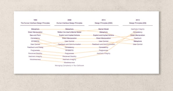
[Figure 1. Change in Apple’s user Interface Guidelines over time.Michael Meyer
The diagram is a representation of how the Human Interface Guidelines have evolved from 1995 to 2015. Because the gestural devices use the operating system iOS, the guidelines for it are presented to the left of the 2015 guidelines for the more traditional Operating System (OS X).
Perceived Stability and Modelessness disappeared sometime after 2008.
Forgiveness and Mental-Model disappear in the jump to iOS, along with the separation of Explicit and Implied Actions.
See and Point disappeared from the iOS Guidelines in late 2010, when moving to iOS 4.
While probably an artifact of changing to an alphabetical listing (previous lists had an implied hierarchy to the principles), the 2015 iOS listing implies that Aesthetic Integrity jumps to the top, and Metaphors and User Control fall to the bottom.
The Missing Principles
The most important principles largely or completely missing in iOS are discoverability, feedback, recovery, consistency, and the encouragement of growth:
Discoverability
Discoverability, the ability to look at the system and immediately discover all the possible actions, was always a key component to the success of Apple designs. The principle was called “see and point” in the early days (and in Figure 1) because all possible actions were represented by objects such as buttons, icons, or menu list items that were visible to the user: See the action you want to do, point the mouse cursor at it, and one click delivered it. Simply put, discoverability means making actions discoverable–visible–so that they do not have to be memorized. The menus in the traditional desktop computers served this purpose well. Labeled icons do as well. Unlabeled icons most often fail, but the worst culprit of all is the complete lack of any cue. Note that discoverability no longer appears in the Apple Guidelines.
Feedback
Feedback and its partner, feedforward, allow a person to know what happened after an action was done (feedback) or to understand what will happen if the action is selected (feedforward).
People depend on a steady stream of feedback to know how effective their actions have been. In the physical world, feedback is automatic. In the world of software, feedback occurs only if the designer has thought about it. Without feedback, people can be unsure of the current state: They will neither be in charge nor feel in charge.
Recovery
Errors happen. Recovery dictates it should be as easy or easier to undo than to do. (Called “forgiveness” in the guidelines and Figure 1, it too has disappeared from the current guidelines.) Recovery was implemented with the command “undo.” Undo originated in 1974 at the (then) Xerox Corporation’s Palo Alto Research Center (PARC), probably by Warren Teitelman. The Apple Lisa and Macintosh, as is well known, derived their basic structures from the early development work at PARC (Apple purchased the rights from Xerox). The Undo command can itself be undone by means of “Redo.” Undo and redo provide a powerful method both of recovering from errors but also of experimenting, trying things out, knowing that test operations can always be undone or redone.
Undo enables a user to recover content. Back is a companion command that enables a user to recover the user’s previous location in a navigational system. The original graphical user interfaces eliminated the user’s need to back up by eliminating navigation. Instead, documents and tools are brought to the user. Browsers and iOS are a throwback to the earlier navigational interfaces, where users wander about a labyrinth of passages leading to modal screens.
Browsers, in supporting the navigational system called the web, provide a Back button so users can move backward in their journey. IOS provides no such generalized tool, so that, for example, if you accidentally fire off a link from inside an app that takes you to Safari or YouTube or any one of many, many other places, there is no straightforward means of recovery. Back and Forward should be standard buttons in iOS so that the interface is forgiving of accidental navigation, instead of punitive.
Consistency
Most technology users have more than one device, yet the operations of the different devices often clash. Even within the same device, Apple has violated consistency: Rotate the iPhone, and keyboards change their layouts; rotate an iPad, and the home screen icons reorder themselves, with no simple way to predict where an icon will end up.
Consistency is still listed in the guidelines–but it is not followed. The Magic Mouse works differently than the track pad, which is different than gestures on the iPhone or tablet. Why? (Such inconsistencies can usually be traced to designers working away in isolation, never talking with one another. As Conway , the products of a company reflect the organizational structure of the company.)
Encourage Growth
Good design encourages people to learn and grow, taking on new and more complex tasks once they’ve learned the basics. Snapshot takers grow to become photographers, personal journal writers become bloggers, and children try programming and end up seeking careers in computer science. For decades, encouraging learning and growth was the life blood of Apple, a principle so important that it was universally internalized and understood.
 ABISAG TÜLLMANN
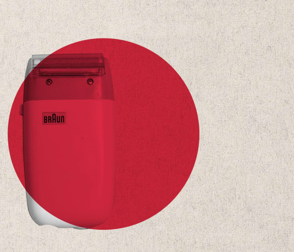
Dieter Rams And The Minimalists’ Rationalization
Many of the worst of Apple’s hidden principles are often excused by claiming that Apple is only following the teachings of the famous German designer Dieter Rams, who for many years was responsible for the beauty and understandability of the products of the German company Braun. They specifically cite Rams’s 10th Principle: “Good design is as little design as possible” (Vitsoe, 2015). But note that this is his 10th Principle, not his 1st. It might be rewritten as, “If you’ve followed the first nine principles, well, it’s time to stop. Don’t start cluttering things up.” Apple, however, has violated many of those earlier principles. Here are all 10 principles of good design:
1)Innovative
2)Makes a product useful
3)Aesthetic
4)Makes a product understandable
5)Unobtrusive
6)Honest
7)Long-lasting
8)Thorough down to the last detail
9)Environmentally friendly
10)As little design as possible
It is useful to look at Dieter Rams’s descriptions of some of these rules:
2. Makes a product useful
A product is bought to be used. It has to satisfy certain criteria, not only functional, but also psychological and aesthetic. Good design emphasizes the usefulness of a product while disregarding anything that could possibly detract from it.
Usefulness is essential to Rams. Obscuring controls, eliminating vital functions such as Undo and Back, do not make a product useful. Quite the contrary.
Marco Illuminati
3. Aesthetic
The aesthetic quality of a product is integral to its usefulness because products we use every day affect our person and our well-being. But only well-executed objects can be beautiful.
In his writings and talks, Rams made it clear that aesthetics was not simply restricted to the visual appearance: The objects had to be well-executed in every aspect of design in order to be aesthetically beautiful. As his 2nd Principle states, this includes function and psychological factors (such as understandability and usability).
Marco Illuminati
4. Makes a product understandable
It clarifies the product’s structure. Better still, it can make the product talk. At best, it is self-explanatory.
Although Apple’s design principles still do talk about the importance of understandability, the products do not reflect this property. Apple’s interfaces have invisible buttons and controls and, in general, a lack of aids for understanding.
Consider the on-screen keyboard on the iPhone and iPad. The Apple keyboard shows the letters in upper case, no matter what is actually being typed. The only way of telling whether the keyboard will produce a capital or a lower case letter is to look at the keyboard’s up-pointing arrow, which is either black or white. Weird: First of all, this means that people have to recognize that the up-facing arrow is the control for upper/lowercase. Second, it means that they must know which color indicates which case. Quick—without looking at your Apple phone or iPad, which color do you think represents lowercase?
Google’s Android screen keyboard shows the keyboard in uppercase when the letters will appear in uppercase, and in lowercase when the letters will appear in lowercase. See, it isn’t hard. Just think about how normal folks use the system.
But even where the guidelines are trying to enhance understanding, they try to minimize the use of informative material, what Norman calls “signifiers.” (While Norman calls them signifiers, revealing his bias toward their communicative function, Apple calls them “decoration,” revealing their own bias.)
To signal interactivity, the built-in apps use a variety of cues, including color, location, context, and meaningful icons and labels. Users rarely need additional decorations to show them that an onscreen element is interactive or to suggest what it does.
The latest Human Interface Guidelines do try to remedy these issues. Moreover, Apple is now providing tools to ensure compliance. For example, our complaints about the legibility of fonts are being addressed. First, the guidelines now state: Above all, text must be legible. If users can’t read the words in your app, it doesn’t matter how beautiful the typography is.
Second, Apple provides a tool, “Dynamic Type,” to do font changes properly without requiring the developer’s attention. The guidelines explain that Dynamic Type makes automatic adjustments to letter spacing and line heights, and responds appropriately “to changes the user makes to text-size settings (including accessibility text sizes).” It will take some time before we can tell if these changes are helping. Unfortunately, once a culture has been set, it is difficult to change, and Apple has deliberately made the culture into one that emphasizes visual appearance over understandability and usability.
IOS 9
Passing critiques on a high-technology company with rapid product cycles is a challenge. Indeed, in Apple’s latest release of its mobile Operating System, iOS 9, a number of the issues we have discussed have been addressed. But this brings up two issues:
What took them so long?
For example, the design decision that when a keyboard is in uppercase mode, it should display uppercase letters and, when in lowercase mode, it should display lowercase letters, is so obvious that the failure to provide this simple feedback on the current mode defies all credulity. Well, this is not how it used to be at Apple: While it is finally correct in iOS 9, what took so long?
The solutions Apple has adopted create yet more memory load on the poor users.
The headline of a Forbes article says it all: “Apple iOS 9 has 25 Great Secret Features.” Secret features? If these are such great features, why are they secret? Why are they so difficult to get to? There are new ways to swipe: from the right, left, top, and down. From the center. With one, two, or more fingers. And in our experience, the same swiping motion with the same number of fingers seems to give different results at different places.
Apple: Please learn about the power of signifiers, visible indicators that help the poor, befuddled user. And make them unambiguous. Here is an example of what not to do: The icon for “rotation of the screen is locked” is either grayed or not. But is it locked when it is gray or when it is not gray? Turns out that Apple uses text to say which, but in tiny little letters somewhat removed from the icon itself. One of us, who spent five minutes searching for information on how to disable the lock, finally discovered the text–why does it take five minutes to learn what should be a frequent operation?
The Problem And The Solution
Good user experience can only flow from a system where marketing, graphic and industrial design, engineering, and usability all work together in a collaborative effort to make life better, more enjoyable, and more productive for Apple’s customers.
Design is a complex field, with many separate subdisciplines. Industrial design is primarily concerned with materials and form, and this is the area in which Apple excels. Graphic design is supposed to be about aesthetics and communication, but Apple has emphasized appearance to the great detriment of the communication component.
Interaction design should emphasize discoverability, feedback, and the person’s ability to feel in control. Alas, the current interaction emphasizes the pleasurable emotional impact—which is important—at the expense of the understanding part, the part that lets people develop a good mental model of how the system works—which is at least equally important.
Apple’s design process has become unbalanced. The Human Interface Guidelines address the imbalance, but are aimed at developers, and developers are not the problem. Apple is.
Today, people are forced to remember arbitrary gestures and placements. We never know whether something is permitted or not. When we accidentally touch the screen and the system takes us somewhere new, there is no way to back up and get to the earlier location—we most often have to start all over again. The designs appear to have discarded the science and Apple’s own experience in interaction design, an area in which Apple was once the leader.
Graphic and interaction designers have to work in equal partnership (along with industrial designers, engineers, and programmers). All design needs to be tested by trained professionals for both bugs and usability to see whether changes have helped or harmed.
We conclude by summarizing the statements in Apple’s current guidelines, statements that are correct and appropriate and that convey the proper design philosophy.
Deference. The UI (user interface) helps people understand and interact with the content, but never competes with it.
Clarity. Text is legible at every size, icons are precise and lucid, adornments are subtle and appropriate, and a sharpened focus on functionality motivates the design.
Depth. Visual layers and realistic motion impart vitality and heighten people’s delight and understanding.
And finally: Although crisp, beautiful UI and fluid motion are highlights of the iOS experience, the user’s content is at its heart–make sure that your designs elevate functionality and defer to the user’s content.
Wonderful. Please, Apple, follow both the spirit and the letter of your own guidelines.
Related: History of Apple in Under 3 Minutes
Source: fastcodesign.com
Article By: Don Norman and Bruce

6 Responses
Your complaints about Apple are quite reasonable. One of them was low contrast fonts, posted on a web site of low contrast fonts. You need to practice what you preach, and make your own site more legible.
Dein Beitrag gefällt mir sehr gut! Weiter so 🙂
thank you very much
Cool, I’ve been looking for this one for a long time
+ for the post
don’t think anything