Material Design is the “it” phrase that many designers are talking about right now. The concept, which was developed by Google for Android devices has a neat, clean and highly-usable charm.
Websites featuring Material Design are creeping out of the realm of Android devices and are popping up everywhere. And the reality is, many of these websites have the exact same look and feel.
Material Design review
f you aren’t quite sure what Material Design is, here’s a quick primer: it’s a Google-spawned concept with that specifically explains how apps for Android should look and how the user interface should work. It defines rules for animation, style, layout, components, patterns and usability. The specifications go as far as defining color palettes and typography options.
And while all of these elements contribute to a highly usable and visually pleasing design, the result is a collection of designs with a common aesthetic.
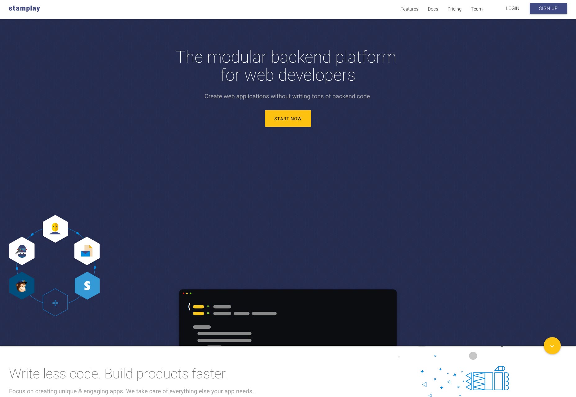
Material Design is breaking away from the initial Android surge as well. Even though the concept is the brainchild of Google, designers are running with it and using Material Design for websites across a variety of platforms and for all device types.
The ultimate goal of Material Design is to “create a visual language that synthesizes classic principles of good design with the innovation and possibility of technology and science.” A single “visual language” begs the question: is Material Design killing the Web?
Material Design Lite
The singular language is moving from mobile-first design thinking to all-device design thinking. Google unveiled Material Design Lite earlier this year as a streamlined version of the aesthetic for all websites.
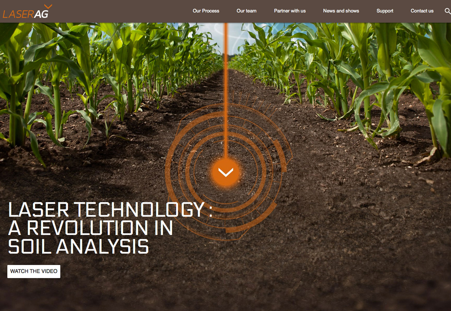
The “framework agnostic” templates make it easy to create something quickly and per the specifications. It is designed to work on blogs, content heavy sites, for dashboard, and visual projects, and even single page sites. The design gets watered down even more.
Follow the rules for a “tight” design pattern
Material Design works because it is based on a pretty tight set of rules and usability patterns. It does some pretty great things for design — the guidelines for animation are especially important to understand because they are rooted in the physical world. The rules do come with plenty of constraints though and what is happening so far is that most applications using Material Design look like they may have come from the same box.
These tight patterns were developed in part to help users understand how to interact with smaller devices. Material Design evolved from flat design, where not all user interface elements had clearly defined roles in the scope of the design. Material Design sought to remedy some of those issues.
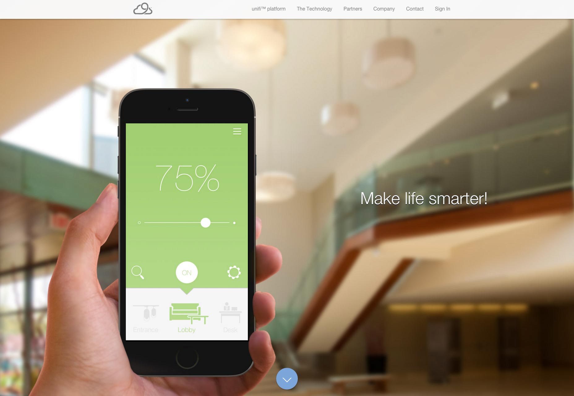
But it is probably time to evolve again. Most users understand what buttons are and what they do. Every evolution of a design theory teaches users something new about how to use devices and the web. And they catch on fast. Tools designed to teach users just don’t need to last that long.
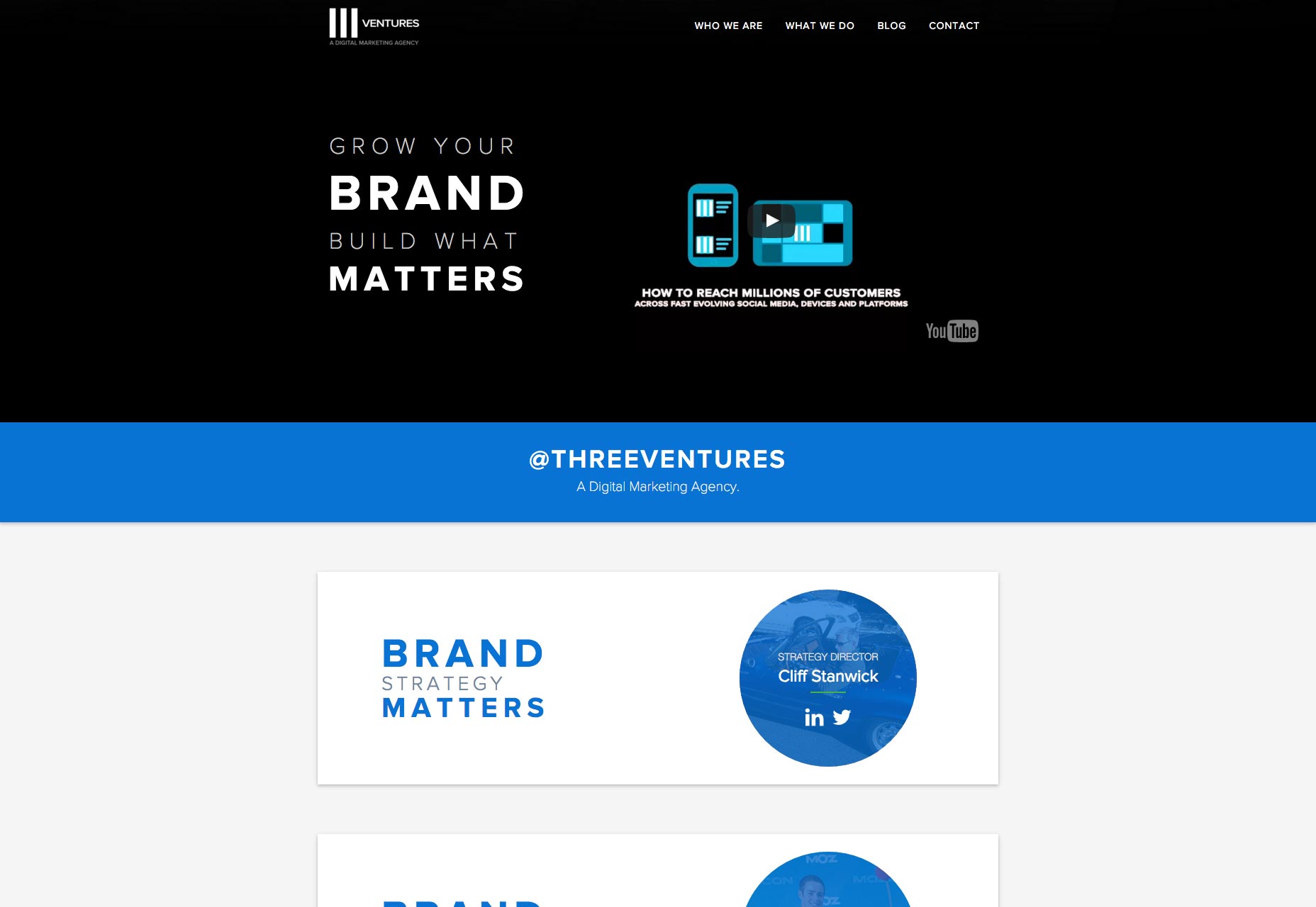
Oddly enough, the tight design pattern is something designers have almost pushed on themselves when it comes to Material Design. Read through the documentation — and note that it changes periodically — and the common designs that are coming out of the trend are simply emulating the provided examples.
So why are designers creating thousands of sites using Material Design that all look the same?
Common UI elements and design divots
Here’s the quick answer to the question above: it’s all in the details.
Common user interface elements, icons, color schemes, and typographic choices are killing aesthetic opportunity on the web. But it does not have to be that way. You can design using material concepts without replicating elements from the documentation or downloading the latest UI kit.
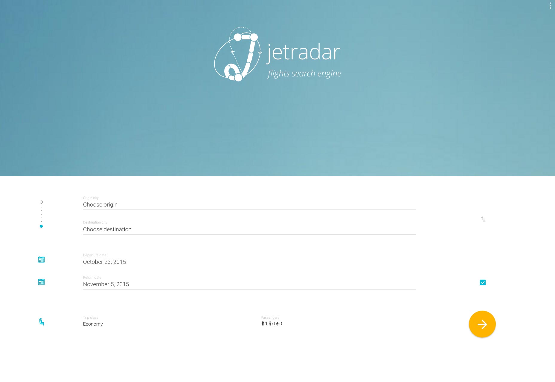
One of the issues that keeps popping up is that websites are replicating the look of Material Design, but don’t have the functionality, and lack attention to detail. It’s not Material Design that’s killing the web, it’s lazy designers.
But wait… you don’t have to follow the trend
Before you freak out, there are plenty of ways to use Material Design that won’t get you labeled as a “lazy designer”.
Here’s the trick: adhere to the concepts, but break some of the rules. Not quite sure what that means? Here are a few suggestions:
- Go beyond the color palette. Instead of a bright, super saturated color palette, go deeper into the colors and play with pastels and darker shades.
- Design icons and user interface elements that follow the basic guidelines for design — such as containing elements inside icons and usage for human characteristics — but aren’t from a prepackaged set.
- on’t go 100 percent “material”. Use one aspect of it in your design concept. The rules for animation are exceptionally nice; follow those guidelines for how things move in the framework of your website; but design the rest as you would had you not been exposed to Material Design. Another great idea to “steal” from material is the use of cards, but don’t limit yourself to designing them in a wholly material space.
- Use some of the best guidelines from Material Design to help you get a better grasp on working with details in your design work. The icon section of the documentation is a good primer on using a grid to create icons that are consistent in their spacing. Apply those concepts to your overall aesthetic.
- Expand the typography palette. One of the things that “kills” design is too many things that look exactly alike. Match typefaces to your design, and don’t use something because a set of guidelines (unless they are from your brand) tell you to.
- Design as you would with any other trend. Material Design is a trend, not an end-all design solution. Mix and match the parts you like and use them just as you would with anything else. Some techniques will work seamlessly, while others may not be for your projects.
Conclusion
So, back to the main question: is Material Design killing the web?
Quite simply, no. While overuse of this trend can lead to homogenous designs, the real problem is designing with a trend for trend’s sake and not thinking about the best tools and techniques for the project. So go ahead, use Material Design, just make sure to use it well.