The controversial and the overlooked logos if there’s one thing we learned this year, it’s that people take their brand marks really, really seriously. Looking back, it almost feels like 2012 was the year of the logo re-design controversy: from the downpour of outrage prompted by Microsoft’s new branding to the whole University of California scandal that just shook the world of identity design (and that’s not to mention the glorious London Olympics fiasco), consumers and designers alike have made their grumblings heard like never before.
Amidst all this hullaballoo, dozens of prominent organizations actually introduced sleek, challenging new designs, many of which escaped our notice entirely. So, now that the year is coming to an end and the dust has settled, we thought we’d comb through the heap (which is to say, the Brand New archives) and showcase some of these overlooked gems. But first a quick, sober walk down memory lane: we’ll start with the most hysterical branding controversies of the year.
Design hysteria
Microsoft
Microsoft has long been stuck playing the part of Apple’s nerdier cousin. In the wake of Steve Jobs’ death, however, it suddenly seemed like the ball might — just might — be back in Microsoft’s court. The image rivalry was hot again, but when the time came to show its hand, Microsoft threw down … tiles.

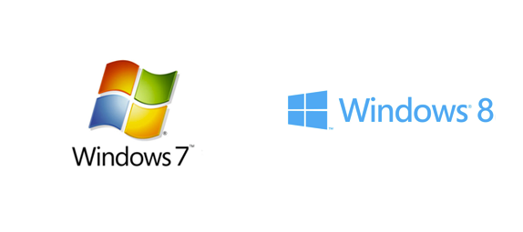
Microsoft took the tiles to a new degree of simplicity in its product-wide identity re-design
Disappointment was palpable. Someone ran a pretty excellent contest on 99designs, urging the community to improve upon the Windows 8 design. An independent designer, Andrew Kim, introduced an alternative branding scheme of his own that, in all seriousness, completely rules.
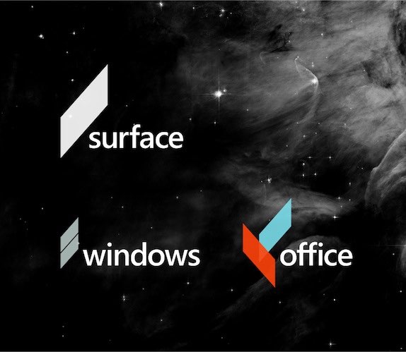
Andrew Kim‘s beautiful independent proposal for Microsoft’s new identity
At the end of the day, though, are the tiles really so terrible? The brand, which includes Windows and Surface, feels cohesive and clean. Maybe Microsoft doesn’t have to be Apple, after all.
Stedelijk Museum
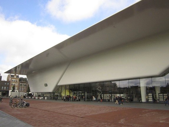
The Stedelijk museum’s new, bathtub-esque wing
Amsterdam’s Stedelijk, one of the oldest and most respected modern art museums in Europe, decided that it needed a makeover. So they brought in a cutting edge architecture team to add a new wing and a graphic design studio, Mevis & Van Deursen, to construct a new identity scheme. As for the building, it turned out to be an enormous bathtub (see above). As for the logo, well, it speaks for itself:

The Stedelijk museum’s new logo is simple, but will it turn out iconic or just silly?
Not surprisingly, people have strong (and generally negative) feelings about both. The logo is certainly rudimentary, but it is also inviting in its simplicity and opens doors to a range of design solutions, as demonstrated in this video:
Elucidating the new branding scheme, from Stedelijk Museum on Vimeo.
As for the tub, we’ll leave that debate to the architecture critics.
London Olympics
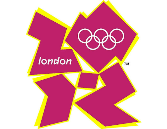
The London Olympics logo took a lot of flak, but we liked it
People compared the London Olympics logo, by Wolff Olins, to everything from a Simpsons character performing a sex act to hateful fascist emblem. Malarkey! We stand by it to the bitter end as one of the most distinctive and effective logos in Olympic history. One thing’s for sure: it beats the logo for Rio 2016:
eBay

To the dismay of many, eBay drained the retro charm from its logo in favor of something more up-to-date
When eBay traded its funky, iconic web 1.0 logo for four sans serif letters at uncomfortably close kerning, people lost their heads — including (and perhaps especially) us. We promptly challenged the community to re-funkify the eBay logo and, after receiving an amazing outpouring of out-of-the-box designs, selected this lovely design by ::ALBRKH:: as our winner.

Our top pick from the eBay re-design contest plays with a retro, neon tubing look
A few months down the road we still love the designs that 99ers produced. At the same time, we have come to terms with the online marketplace’s official choice. Let’s leave it at that.
University of California
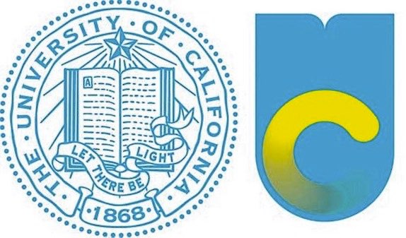
People went berserk when the University of California revealed its new, dubiously gradient-forward logo
It’s been a rough month for the University of California’s in-house creative director, Vanessa Correa. After enduring a solid barrage of hate toward her new logo design from students, professors and even the state’s lieutenant governor, she watched the University take the public’s side and withdraw her work. On the one hand, the University is accountable to the public so, from that standpoint, there was little option but to withdraw the new branding. On the other hand, the public at large is not aware of what makes for effective branding and tends to have knee-jerk reactions to the unfamiliar. Anyway, one thing is for sure: that awful yellow gradient had to go.
Hidden gems: overlooked logo re-designs, organized by industry
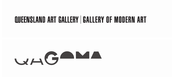
(note: as with the above, old logo will appear at left, new at right)
Airlines


Arts

Automobile

Education

![]()


Finance


Food

Healthcare


Publishing/media


Sports
Tech


Television

Tourism


Source: 99designs.com
Article By: Alex Bigman
3 Responses
Thanks, great article.